
Horizontal scroll section: a gallery that slides sideways
Slide a row of cards to the left as the customer scrolls down the page, for a lookbook, process steps or a product gallery.
The Horizontal scroll section shows a row of cards (one image and one caption each) that slides sideways as the customer scrolls down the page. On desktop, the section pins to the screen while the whole row goes by; on mobile, the customer swipes through the cards. It's an ideal format for a lookbook, the steps of how something is made or a series of mood photos.
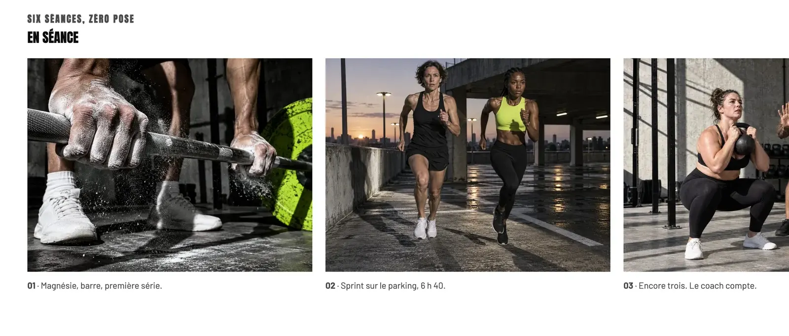
The presets
Horizontal gallery
The only preset: a heading above six cards, each made of an Image with rounded corners and a caption Text. The section takes up the full height of the screen while the cards scroll.
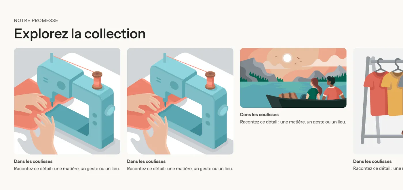
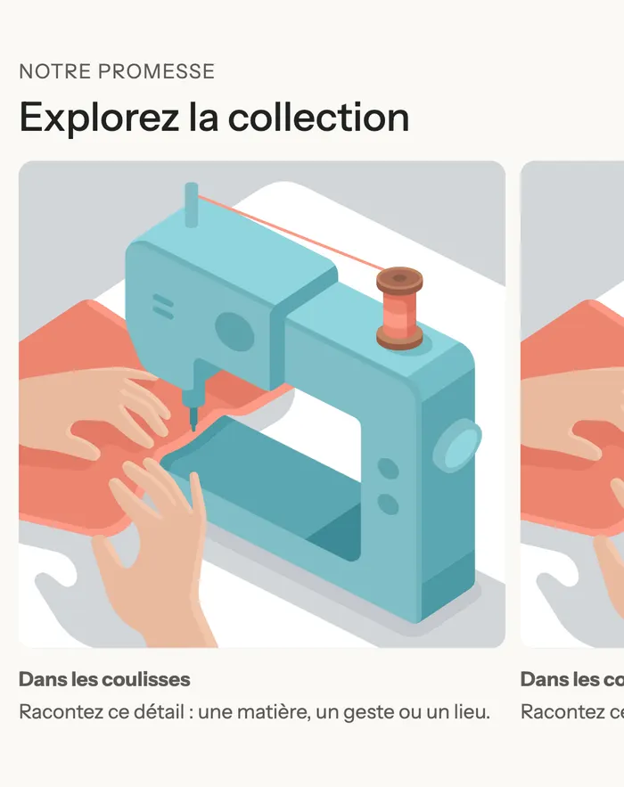
On mobile, the cards take up 78% of the screen width: the next one peeks in on the right and invites a swipe.
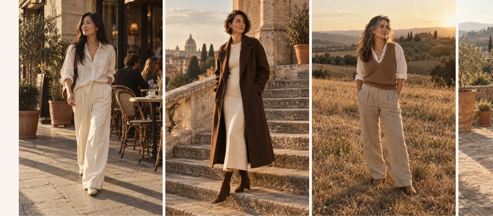
A lookbook without captions
The Maison Mocha demo's lookbook page uses the section with large portrait photos placed right next to each other, with no heading or text:
Add the section
- In your Shopify admin, open Online Store > Themes and click Edit theme.
- Choose the template from the menu at the top (for example Home page, or your lookbook page template).
- Click Add section, open the Scroll effects category and choose Horizontal gallery.
- In each card (Group block), click Image to choose the photo, then Text for the caption.
- For one more card, duplicate an existing card or add a Group with Add block.
- Click Save.
The section's blocks
The section accepts every block from the theme. Each block placed after the first ones becomes a card in the row.
| Block | What it's for |
|---|---|
| Heading (or any block placed first) | Stays above the row: the Blocks above the row setting decides how many blocks stay at the top. |
| Group | One card. In the preset, it holds an Image and a Text, but you can add a button, a price, a badge… |
| Image, Video, Content over image… | You can also use these blocks directly as cards, without a group. |
For an image that fills the whole card with text on top, use a Content over image block as the card.
The section settings
Layout group:
- Height: Full screen (default, the section fills the screen while the cards slide) or Fit the content.
- Card width: from 200 to 720 px on desktop (380 px by default).
- Card width on mobile: as a % of the screen (78% by default).
- Blocks above the row: the number of first blocks that stay above the cards (1 by default, the heading). Set it to 0 if you have no heading.
Section group: the background Color palette. Then Separators, as on the other sections (Understand the theme editor).
Tips and pitfalls
- The slide-on-scroll effect only plays on wide screens (from 990 px). On tablets and phones, the cards are swiped by finger.
- If the visitor has asked their device to reduce motion, the cards don't slide on scroll.
- Choose images with the same shape: a row of uneven heights looks messy.
- The more cards you have, the longer the section stays pinned to the screen. Six to ten cards is a good maximum.
- Keep captions short: they scroll along with the image and are read in passing.
- In the editor's section picker, the preview shows the row standing still: that's normal.