
Scrollytelling section: a pinned image that changes at each step
Tell a gesture, a routine or a product's strengths step by step - the image stays pinned on screen and changes when the customer reaches the next step.
The Scrollytelling section pins an image (or a video) on one side of the screen and a series of steps on the other. As the customer scrolls through the texts, the image changes to show the current step. It's the ideal format for a three-step routine, a product's instructions for use or the main stages of how you make things.
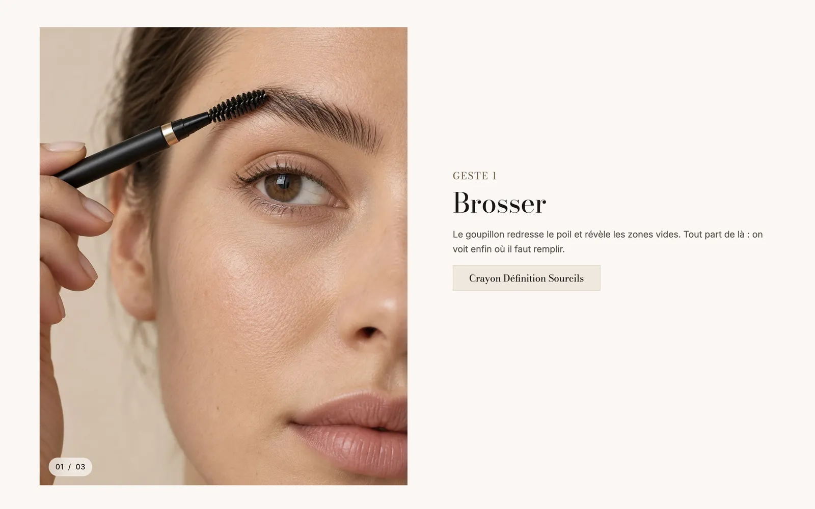
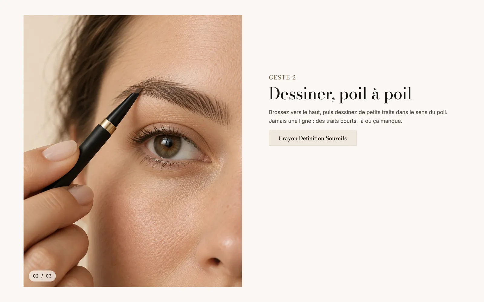
When the customer reaches the next step, the image cross-fades and the counter moves to 02 / 03:
The presets
Scrollytelling
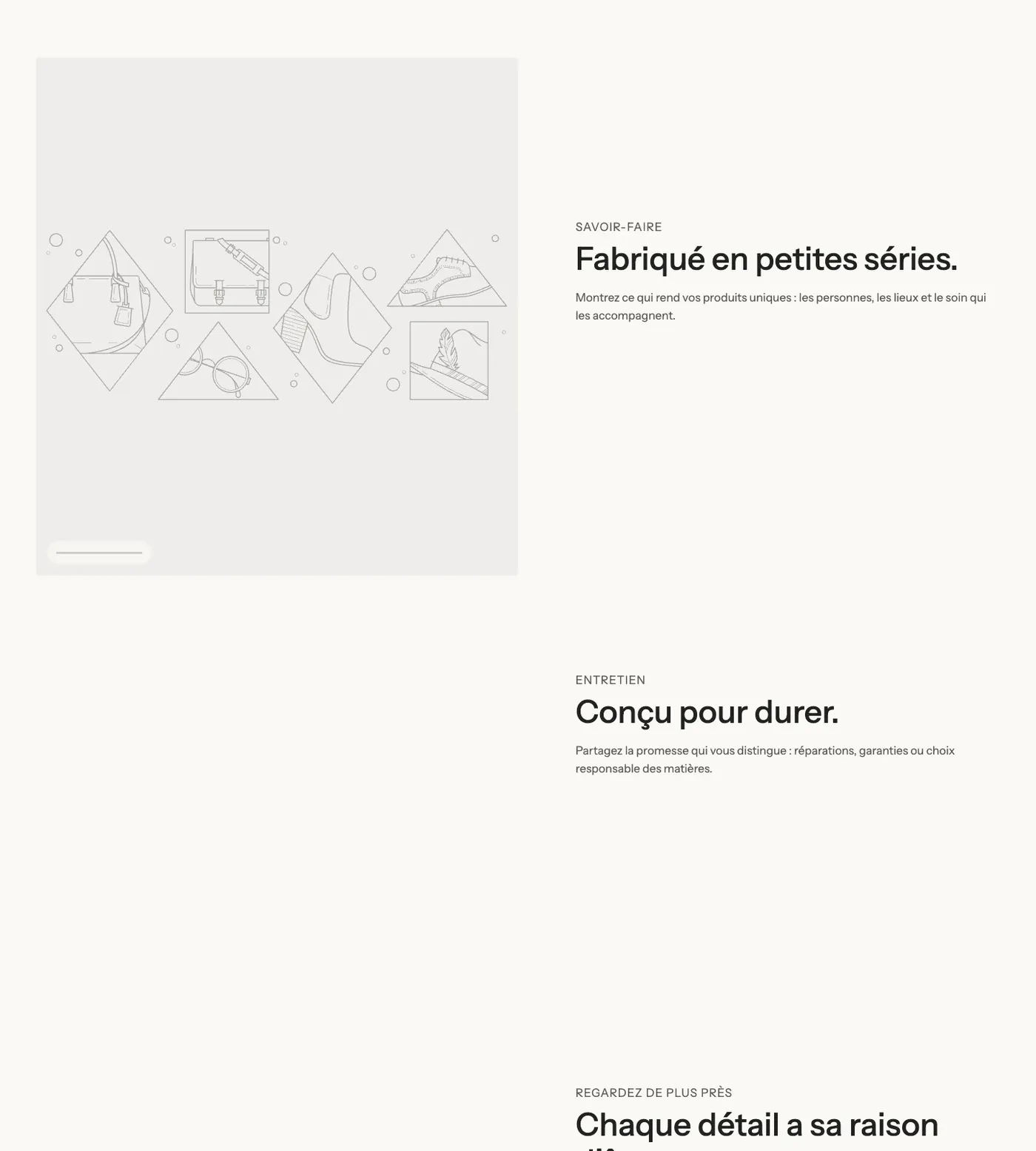
The only preset: three steps, each with a subheading, a heading and a text (and a button on the last one). The media is on the left, over half the width, and takes up 80% of the screen height.
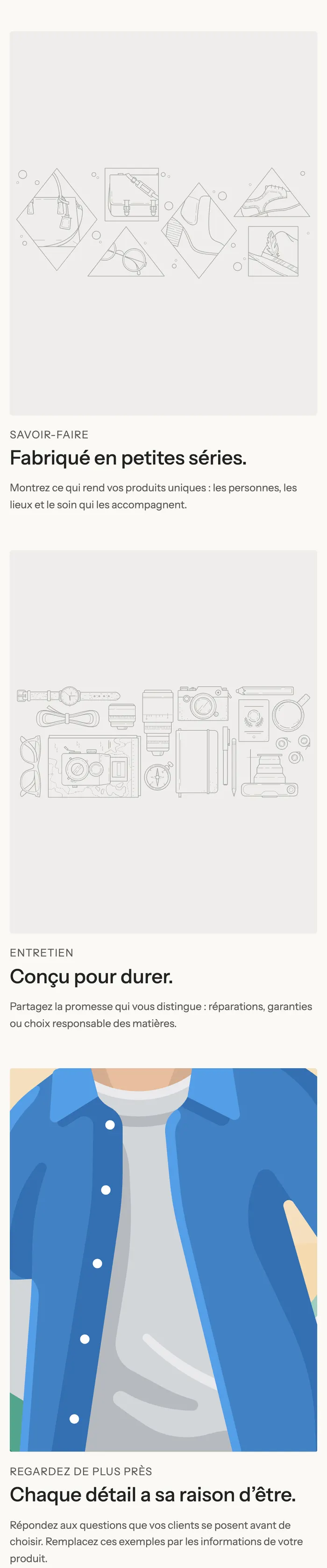
On mobile, there's no pinned image anymore: each step shows its own media above its text.
An example on a dark background
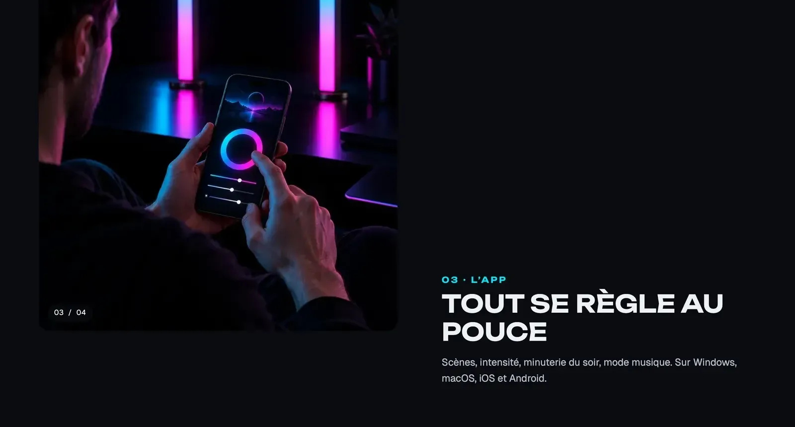
The Lumyx demo walks through four numbered steps (syncing, colors, app, installation) on a night background, with the Numbers counter at the bottom of the image:
Add the section
- In your Shopify admin, open Online Store > Themes and click Edit theme.
- Choose the template from the menu at the top (for example Home page or a product template).
- Click Add section, open the Scroll effects category and choose Scrollytelling.
- Click each Step block: choose its Image (or Video) in the right-hand panel, then edit the heading and text.
- For one more step, click Add block and choose Step.
- Click Save.
The section's blocks
| Block | What it's for |
|---|---|
| Step | One step of the story: the media shown during this step, and the text blocks next to it. |
| Heading, Text, Button, Checklist, Price… | The content of each step, to add inside the Step with Add block. Every block from the theme is accepted. |
The Step block
- Image: the step's image. It also covers the video while it loads, and its focal point keeps the subject framed on every screen.
- Video: a video instead of the image, played during the step.
Everything else (subheading, heading, text, button to the product) is built with the blocks you place in the step.
The section settings
Layout group:
- Media position: Left (default) or Right.
- Media width: from 30 to 70% (50% by default).
- Aspect ratio: Height in % of the screen (set with Height in % of the screen, 80% by default), Portrait (4:5), Square, Portrait (3:4) or Wide (16:9).
- Aspect ratio on mobile: Portrait (4:5) by default, Square, Portrait (3:4), Wide (16:9) or Vertical (9:16).
- Corners: Theme or Custom with Corner radius.
- Transition between two images: Fade or Zoom.
- Progress indicator: None, Progress bars (default), Numbers (01 / 03) or Dots.
- Minimum height of each step: as a % of the screen height (70%). The larger it is, the more the customer scrolls before the image changes.
Section group: the background Color palette. Then Separators, as on the other sections (Understand the theme editor).
Tips and pitfalls
- Three or four steps are enough: beyond that, the story takes too long to scroll through.
- Use images with the same shape and lighting, shot as a series: the switch from one to the next then looks natural.
- Keep the text short for each step (a heading and two sentences), so it fits next to the image.
- Put a button to the product in the step where it's used: the customer buys at the moment they understand.
- Check the mobile rendering with the editor's mobile preview button: each step shows its own image there, so choose an Aspect ratio on mobile that suits your photos.
- A video per step weighs more than an image: save it for the step that really needs it.